The Easiest Landing Ever: How to Create a Landing Page with AI
What is a landing page and what is it used for?
A landing page is a standalone web page that operates independently from a full website, focused on promoting a specific product or service. The primary goal of a landing page is to “convert” the visitor who arrives on it – whether through making a purchase, registering, or leaving contact information. Therefore, the page is designed to provide comprehensive and specific information about the product or service, its value proposition and a call-to-action button prompting the user to take the desired action.
Beyond that, the landing page is a key “junction” in any customer journey or marketing campaign. It is the point where the visitor, already exposed to a marketing message, now shows real interest in the promoted product or service. This is why business owners, marketers, and other professionals invest time, money, and thought into creating every landing page: from crafting clear and sharp messaging to designing the signup form and ensuring the colors align with the brand identity. In fact, despite being just one page, working on it often takes days or even weeks, involving designers, developers, and other specialists.
AI is landing here too
There is no need to complicate it anymore. Creating landing pages will be easier and smoother from now on. As a result of recognizing a need from our customers, we have integrated a unique and innovative feature that will allow you to create landing pages using AI (Artificial Intelligence). With this feature, you can easily create a professional landing page tailored to your specific needs and aligned with your brand’s marketing language in minutes. Here are all the details you need to know about the new feature:

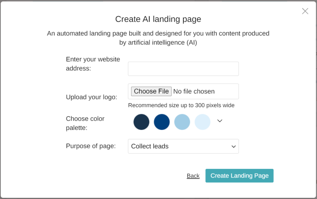
Enter your website URL – Entering your website’s address allows the system to identify your brand’s tone, headings, and texts, and match the landing page accordingly.
Upload your logo – The logo will appear as part of the landing page, helping to maintain your brand identity and visual consistency.
Choose your color palette – Choosing a range of shades for the landing page design will allow you to enjoy a higher level of design while preserving the color scheme of your branding and marketing identity.
Set a goal – Landing pages can be used for various purposes: registering for a digital or physical event (like a webinar or company outing), making a purchase (such as buying a book or a ticket to a specific show), or leaving contact information (getting more details before registering for a degree or course). Defining the goal will refine the structure of the form embedded in the page and guide the customer toward the desired action.
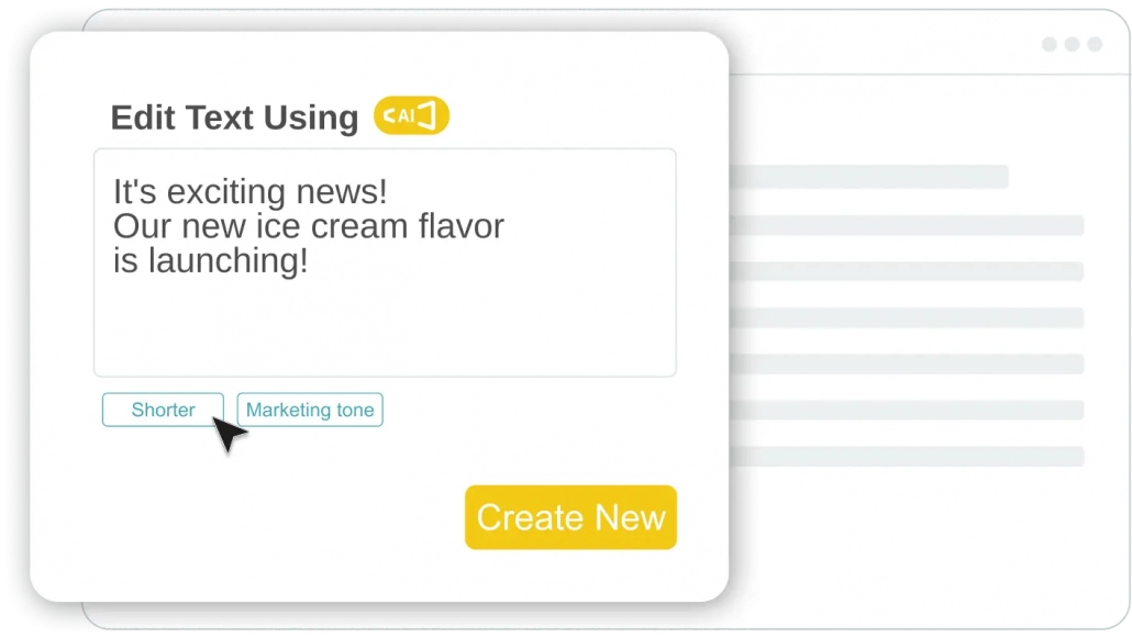
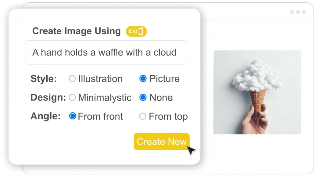
Input content – The first magic has already happened, and your designed landing page is in front of you. Now, all that’s left is to input the content, edit, and fine-tune what’s needed. You can write the content yourself and/or use AI once again. The AI content writing feature can help you with every part of writing: from headlines and subheadings to the marketing paragraph and even the most suitable wording for the call-to-action button (CTA).
Enjoy independence – There are times when a landing page is urgently needed or has to be created on short notice, and its creation can take time. This could cause significant delays in the marketing process, difficulties in interacting with customers, and even the loss of leads and revenue. The new feature makes this process easier than ever, and within a few minutes, your landing page can be live.


