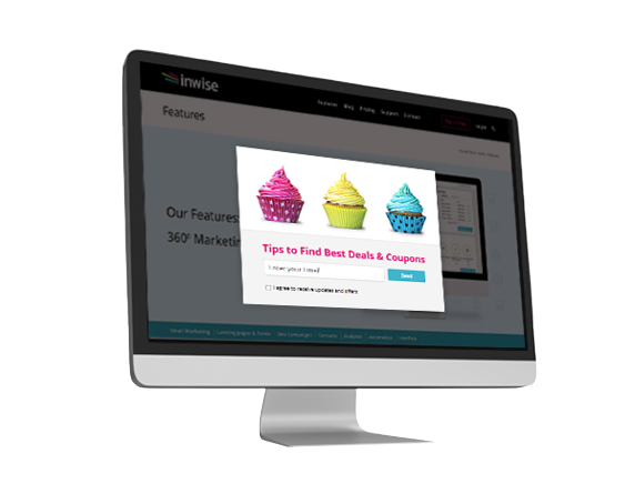
Don’t Fear Pop-Ups, Embrace the Opportunities They Bring
5-10 percent of conversions from visitors to customers is a respectable figure in terms – this is the statistic we know today in regard to the use of pop-ups in a marketing campaign. Despite these statistics, which to a professional eye sounds like a fantastic scenario, many website owners are still on the fence regarding the use of the popup windows, the same ones which we have all learned to hate.
In this article, we will try to present a quick scan of the scenarios, advantages, and disadvantages and examine whether pop-ups are more annoying than advertisements that pop up on the screen and how they can be used in a way that will actually make the user contact us.

Not just an ad – what are the pop-ups used for?
Pop-ups, those same signup forms that pop up, are used to collect leads and expand the distribution list. They are therefore suitable for all types of websites: sales, information, services, blogs, and more.
The pop-ups provide us with a window, literally, for broad marketing and business work. If we wish to get creative, we will use them to motivate our site users to take significant actions: from leaving details and signup for updates to adding items to their shopping carts.
Sign up for mailings and updates and basically – collect new leads
The most popular use of pop-ups is signup for updates. An offer for surfers to sign up for the contact list in order to receive added value, for example – content to be sent by email. This is the place to create a precise and short message, which will suit the target audience, speak to them in a language they know and connect with, and most importantly, give an apparent and worthwhile reason for subscribing.
For example, if we are talking about a store for fashionistas, we could recommend they leave their contact information and be the first to hear about the new items in the collection, before everyone else.
On a site whose target audience is people from the marketing industry, using the pop-up we could invite them to receive updates on the latest articles in the field.
Direct contact – by phone or through the website
By using a popup, we could allow a user visiting our site to leave their information so that we can contact them directly by phone, for scheduling an appointment, receiving details about the service we offer, or further information about our product.
In this pop-up, the offer should be very specific and direct – leave a phone number to get more details.
Directing to a blog
A blog is an excellent tool for marketing and creating interest in the business and the person leading it. Using a pop-up, we can insert links to your blog, invite the user to our site, and read an article on the blog that speaks more elaborately on the topic of the page they are visiting. This way, we will make the user know us better, connect with us and eventually also purchase a product or service from us.
Update on special events
Whether it’s a new workshop or an upcoming lecture, a pop-up is a great way to update users and encourage people to sign up. If you are starting a new cake-baking workshop, you can inform the users of your baking blog about it with a pop-up.
Here are our 5 top tips for a popup design
- It is important to design the popup in the same colors as your logo or branding – so that it matches the look of the website.
- And yet – make it interesting and have it stand out.
- The wording must be short and catchy and above all – contain a clear call for a certain action.
- One call for action in each popup will increase registration and incoming leads.
- Creative, personal and in the language of the target audience – this is how you create conversions.
In an era where exposure on social networks is becoming challenging, a popup is a great way to establish direct and immediate contact with website visitors and generate high-quality leads. The secret is to experiment, examine which design and wording work best and sit back and enjoy high conversion rates.
